Baby Clothes Size: Baby clothes sizes are typically categorized by age and weight, ranging from newborn to 24 months. Sizes may vary by brand, so its important to check specific measurements to ensure a proper fit.

Charts, Graphs and Diagrams
Baby Clothes Size: Baby clothes sizes are typically categorized by age and weight, ranging from newborn to 24 months. Sizes may vary by brand, so its important to check specific measurements to ensure a proper fit.
Political View Illustrated: Political illustrations, often seen in editorial cartoons, use visual satire to comment on political events, policies, and personalities. These illustrations can influence public opinion by highlighting societal issues and political hypocrisies through humor and artistic expression.

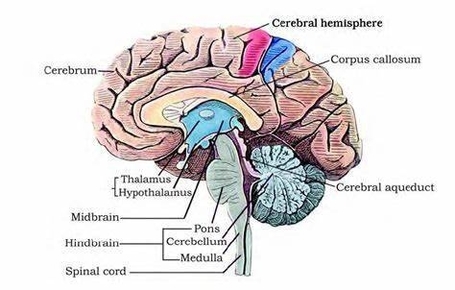
Brain Structure In Detail: The brain is a complex organ divided into several key parts
Human Health Diagram Explained: A human health diagram typically shows various aspects of health, such as physical, mental, and social well-being. It may include factors like nutrition, exercise, mental health, and healthcare access, illustrating how these elements contribute to overall health.

Cell Structure And Function: Cells are the basic units of life, consisting of a plasma membrane, cytoplasm, and organelles. Each organelle has a specific function, such as energy production, protein synthesis, and waste removal, essential for the cells survival and function.

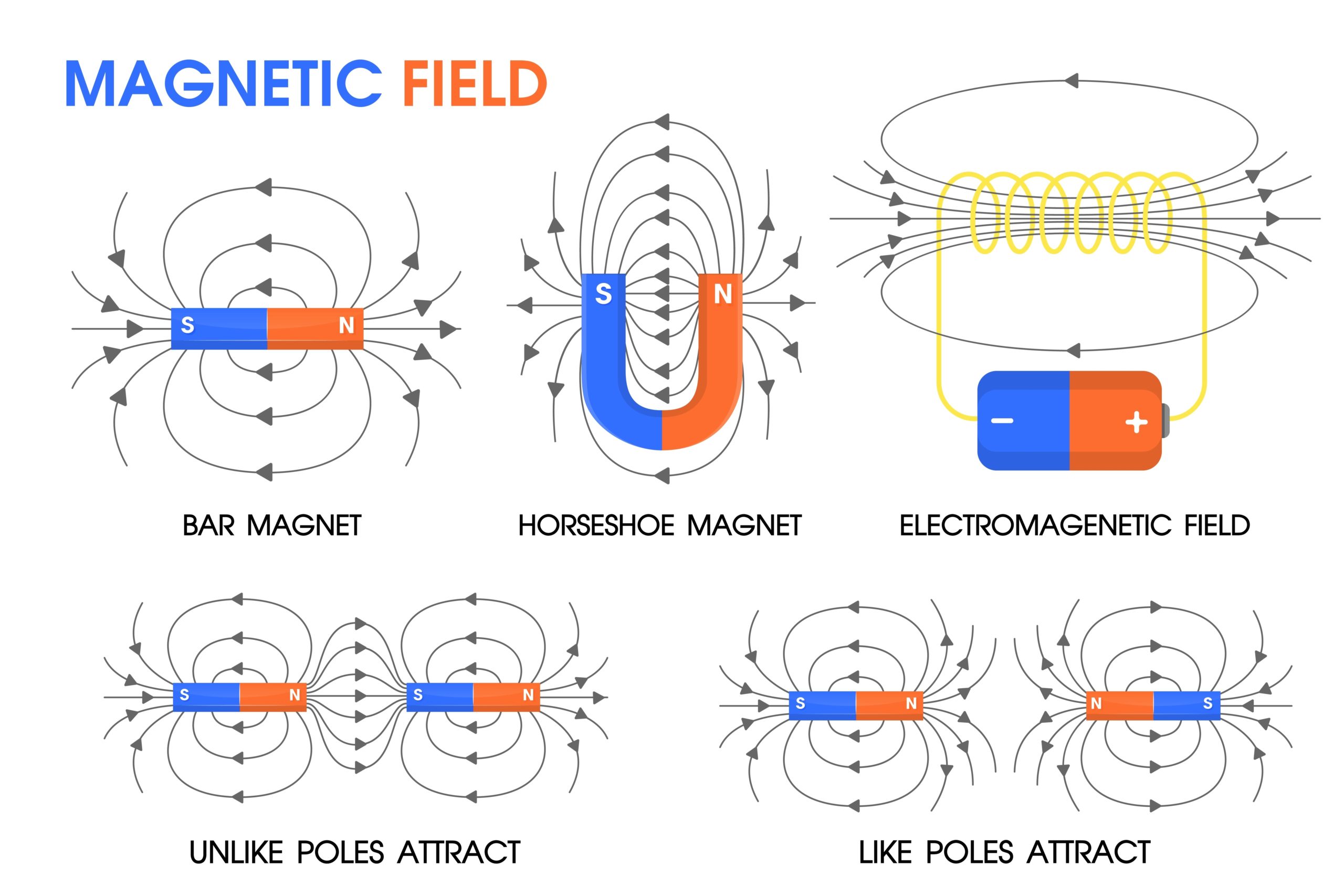
Magnetic fields are a fundamental concept in physics that describe the behavior of magnetic forces. They are produced by moving electric charges and intrinsic magnetic moments of elementary particles associated with a fundamental quantum property known as spin . Magnetic fields and electric fields are both interrelated and are components of the electromagnetic force, one of the four fundamental forces of nature .
The study of magnetic fields is called magnetism. It is a branch of physics that deals with the properties of magnets, magnetic fields, and the effects of magnetic fields on matter . The magnetic field is an invisible field of attraction force that surrounds a magnet. Whenever a subatomic particle with such a negative charge, such as electrons, moves about, it creates a magnetic field .
Electric current produces a magnetic field. This magnetic field can be visualized as a pattern of circular field lines surrounding a wire. One way to explore the direction of a magnetic field is with a compass . The direction of the magnetic field is perpendicular to the direction of the current flow and is determined by the right-hand rule . The magnitude of the magnetic field is proportional to the current and the distance from the wire .
The formal statement of the direction and magnitude of the field due to each segment is called the Biot-Savart law . Each segment of current produces a magnetic field like that of a long straight wire, and the total field of any shape current is the vector sum of the fields due to each segment . The equation for the magnetic field strength (magnitude) produced by a long straight current-carrying wire is:
$$\mathrm { B } = \dfrac { \mu _ { 0 } \mathrm { I } } { 2 \pi \mathrm { r } }$$
where B is the magnetic field strength, I is the current, r is the shortest distance to the wire, and the constant ?0=4?10?7 T?m/A is the permeability of free space .
Magnetic fields such as that of Earth cause magnetic compass needles and other permanent magnets to line up in the direction of the field. Magnetic fields force moving electrically charged particles in a circular or helical path. This forceexerted on electric currents in wires in a magnetic fieldunderlies the operation of electric motors .
In summary, magnetic fields are a fundamental concept in physics that describe the behavior of magnetic forces. They are produced by moving electric charges and intrinsic magnetic moments of elementary particles associated with a fundamental quantum property known as spin. The study of magnetic fields is called magnetism. Electric current produces a magnetic field, and the direction of the magnetic field is perpendicular to the direction of the current flow and is determined by the right-hand rule. The magnitude of the magnetic field is proportional to the current and the distance from the wire. Magnetic fields such as that of Earth cause magnetic compass needles and other permanent magnets to line up in the direction of the field. Magnetic fields force moving electrically charged particles in a circular or helical path, and this force underlies the operation of electric motors..
Human Heart Diagram: The human heart is a muscular organ located between the lungs, slightly to the left of the center. It consists of four chambers

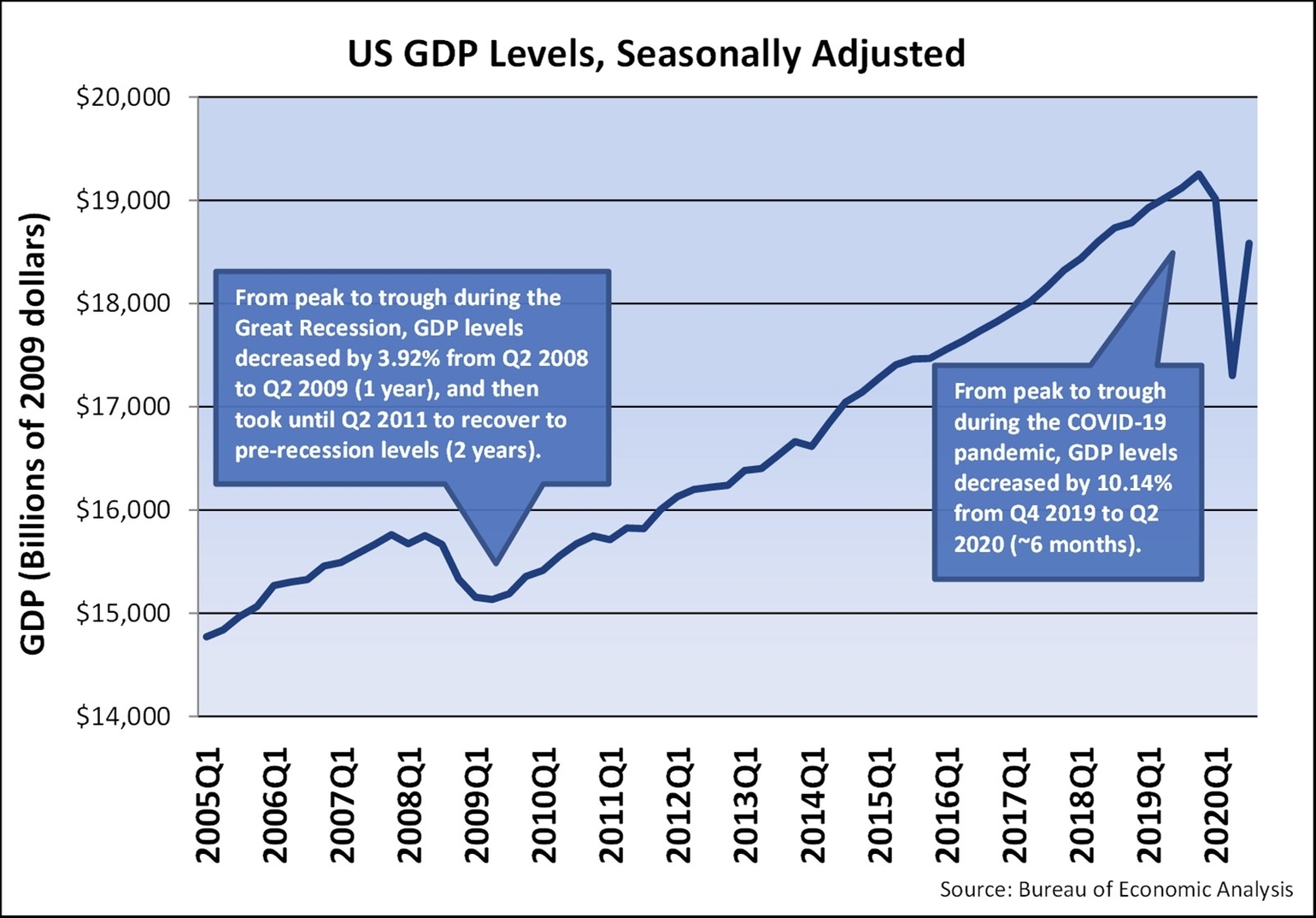
The Gross Domestic Product (GDP) of the United States is a measure of the country’s economic activity and is one of the most important indicators of the country’s economic health. According to the U.S. Bureau of Economic Analysis (BEA), the real GDP of the United States increased at an annual rate of 4.9 percent in the third quarter of 2023, according to the third estimate. In the second quarter, real GDP increased 2.1 percent. The increase in the third quarter primarily reflected increases in consumer spending and inventory investment. Profits increased 3.4 percent at a quarterly rate in the third quarter after increasing 0.2 percent in the second quarter. In the third quarter, the value added of private goods-producing industries increased 10.2 percent, private services-producing industries increased 4.1 percent, and government increased 2.0 percent. Overall, 14 of 22 industry groups contributed to the third-quarter increase in real GDP .
The nominal GDP of the United States is another measure of the country’s economic activity. According to CEIC Data, the nominal GDP in the United States is updated quarterly and was $6,621.6 billion in March 2023, which is an all-time high. The data is available from March 1947 to March 2023, with an average number of $1,057.5 billion. The data reached a record low of $60.8 billion in March 1947 .
The GDP growth rate of the United States is another important indicator of the country’s economic health. According to Trading Economics, the US economy expanded an annualized 4.9% in the third quarter of 2023, the most since the last quarter of 2021, above market forecasts of 4.3% and a 2.1% expansion in Q2, the advance estimate showed .
In summary, the real GDP of the United States increased at an annual rate of 4.9 percent in the third quarter of 2023, according to the third estimate. The nominal GDP of the United States was $6,621.6 billion in March 2023, which is an all-time high. The US economy expanded an annualized 4.9% in the third quarter of 2023, the most since the last quarter of 2021, above market forecasts of 4.3% and a 2.1% expansion in Q2, the advance estimate showed ..
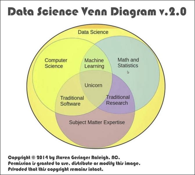
Venn Diagram Of Logical Possibility Vs Scientific Possibility: A Venn diagram of logical possibility versus scientific possibility illustrates the overlap and distinctions between what is logically conceivable and what is scientifically feasible. Logical possibilities encompass all scenarios that do not involve contradictions, while scientific possibilities are constrained by empirical evidence and physical laws.
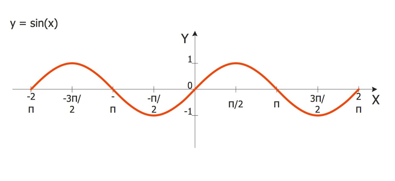
The sine function is one of the most important and widely used functions in mathematics, especially in the field of trigonometry. It relates the angle of a right triangle to the ratio of two of its sides. Here is an overview of the sine function in about 1000 words.
The sine function is usually denoted by sin, and it takes an angle as its input. The output of the sine function is a number between -1 and 1, which represents the ratio of the length of the opposite side to the length of the hypotenuse in a right triangle that contains the given angle. For example, if we have a right triangle with an angle of 30 degrees, then the sine of 30 degrees is 0.5, because the opposite side is half of the hypotenuse.
The sine function can be defined for any real value of the angle, not just for the acute angles in a right triangle. One way to do this is to use the unit circle, which is a circle with radius 1 centered at the origin of a coordinate plane. Any point on the unit circle can be represented by an angle measured from the positive x-axis, called the standard position. The sine of the angle is then the y-coordinate of the point on the unit circle. For example, the point (0, 1) on the unit circle corresponds to an angle of 90 degrees, and the sine of 90 degrees is 1.
The sine function is periodic, which means that it repeats its values after a certain interval. The period of the sine function is 2? radians, or 360 degrees, because the unit circle has a circumference of 2?. This means that the sine of any angle is equal to the sine of the angle plus or minus any multiple of 2?. For example, the sine of 45 degrees is the same as the sine of 405 degrees or the sine of -315 degrees.
The sine function is also symmetric, which means that it has some properties of reflection and inversion. The sine function is odd, which means that the sine of the negative of an angle is the negative of the sine of the angle. For example, the sine of -60 degrees is -0.866, which is the opposite of the sine of 60 degrees, which is 0.866. The sine function is also symmetric about the line y = x, which means that the sine of an angle is equal to the cosine of its complement. For example, the sine of 30 degrees is 0.5, which is the same as the cosine of 60 degrees.
The sine function can be used to model many natural phenomena that involve periodic or oscillatory motion, such as sound and light waves, the position and velocity of harmonic oscillators, sunlight intensity and day length, and average temperature variations throughout the year. The sine function can