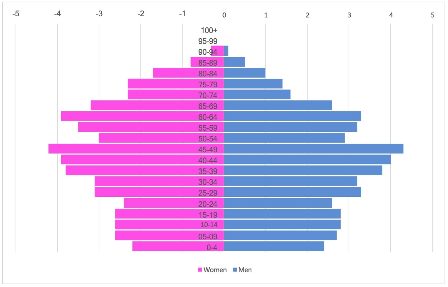
A population pyramid chart visually represents the age and sex distribution of a population, showing the proportion of individuals in different age groups. This tool helps identify demographic trends such as youth bulges, aging populations, or imbalances caused by migration or other factors, and is widely used in demographic and social planning.