Interruptions in the workplace – Employe

Interruptions in the workplace – Employee Interruptions Chart – Social Media Results in Disruption to Work – Effect of Social Media on Employee Productivity Chart and Infographic – Microsoft Survey of Employee Interruptions – Parallel vs. Sequential Tasks Completion – Comparison of Parallel to Sequence Activities – Productivity and Interruptions Costs Chart. Effect of Social Media Interruptions on American Economy Chart. Facebook and workplace. Twitter and workplace. Effect of Facebook and Twitter on Employee productivity and work. Source: http://redeapp.com/index.php/red-e-app-blog/entry/the-social-media-monster-is-alive https://ygraph.com/chart/2526

Interruptions in the workplace – Employe

Brands – Consumer Brands – Illusion of Choice

Brands – Consumer Brands – Illusion of Choice Chart – Coca Cola, Pepsico, Kraft, Nestle, Unilever, Mars, Johnson & Johnson Consumer Packaging Brands. Consumer brands such as Pepsi, Tide, L’oreal, Nescafe, Crest, Wrigley, Quaker, Kellogg’s consumer brands. https://ygraph.com/chart/2109

Brands – Consumer Brands – Illusion of Choice

Organizational Effectiveness – Organizat

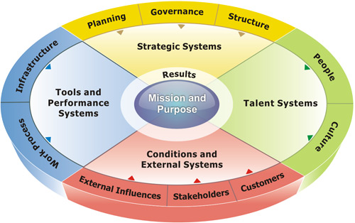
Organizational Effectiveness – Organizational Effectiveness Chart – Organizational Effectiveness Framework and Model. COE. Center of Excellence. Organizational Effectiveness Centre of Excellence . Strategic Systems, Talent Systems, Tools, Structure. Source: COE https://ygraph.com/chart/2110

Organizational Effectiveness – Organizat

Organizational Effectiveness. McKinsey

Organizational Effectiveness. McKinsey 7S framework for organization change, analysis and organization effectiveness. Strategy, skills, structure, system, style, staff, shared value. In this model the elements in an organization. Source: GuruTalks https://ygraph.com/chart/2111

Organizational Effectiveness. McKinsey

7S model of McKinsey and KPMG model. The

7S model of McKinsey and KPMG model. The 7S model developed by Richard Pascale, Tom Peters en Robert Waterman. KPMG Model includes: Management & Organization, Products & Processes, Resource & Systems, People & Culture, Performance model. Source: 123Management https://ygraph.com/chart/2113

7S model of McKinsey and KPMG model. The

Expert Chart. Expert Diagram. How do I

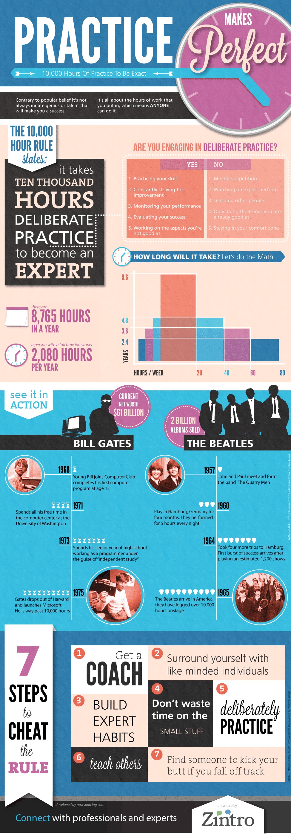
Expert Chart. Expert Diagram. How do I become an expert? It takes 10,000 hours of practice to become an expert. Practice diagram. Malcolm Gladwell Diagram. Blink Framework. Theory of Practice and Becoming an Expert. How to become an expert? Why do I need to practice? Malcolm Gladwell Expert Infographic Chart. Source: http://blog.zintro.com/2012/08/10000-hour-rule-malcolm-gladwells-10000-hours-of-practice-theory-from-outliers-visualized/ https://ygraph.com/chart/2465

Expert Chart. Expert Diagram. How do I

Customer Service Diagram – Customer Serv

Customer Service Diagram – Customer Service Model – Online Customer Service Diagram – Customer Service Best Practices. Client Service Model – Online Customer Service Model – Client Servicing Model including the following key factors: customer support, contact us, emails respond, ordering methods, order tracking, shopping features, payments methods. Source: R. Patel customer service diagram

Customer Service Diagram – Customer Serv

Project Management Diagram. PM Chart.

Project Management Diagram. PM Chart. PMP Designation Chart. PMP Certification Diagram. Project Management Statistics. Project Management Stats. 31% of all projects are cancelled before completion. 88% are past deadline, over budget or both. PMP Infographic. Project Management Diagram. Project Timeline Chart. Project Management Stats Chart. How do I become PMP? Source: http://www.villanovau.com/problem-with-projects-pmp-infographic/ https://ygraph.com/chart/2477

Project Management Diagram. PM Chart.

Saving Money Chart. How to save money c

Saving Money Chart. How to save money chart. This infographic is all about the benefits of thrifting! From helping the environment by removing the water needed to grow cotton for new garments, to saving money on all the clothes kids need for the new school year. Saving Environment Chart. To view the source of the graph, please visit: http://www.voaautodonation.org/news/thrifting-infographic-car-donation-ohio/ https://ygraph.com/chart/2475

Saving Money Chart. How to save money c