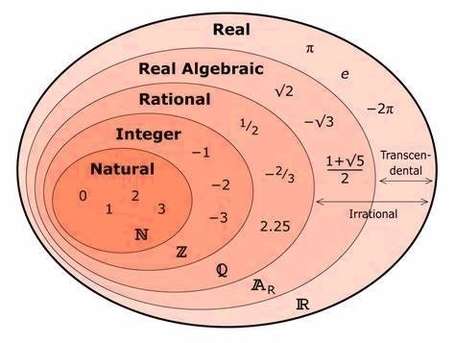
Northern Mariana Islands Population

Chart above demonstrates Northern Mariana Islands Population. This is according to World Bank total population stats. Latest population information for Northern Mariana Islands.

The Northern Mariana Islands have a small population characterized by moderate growth, influenced by fertility rates, migration, and economic factors. Population distribution is concentrated on a few islands, with urban centers serving as economic hubs.

Northern Mariana Islands Population

Kuwait Population

Chart above demonstrates Kuwait Population. The country statistics are compiled by World Bank. Based on the latest demographics info provided for Kuwait.

KuwaitÂ’s population is characterized by a significant proportion of expatriates alongside a growing native population. High birth rates among nationals and steady immigration drive growth. Urbanization is concentrated around Kuwait City, with economic prosperity supporting demographic expansion, though social dynamics are shaped by migration patterns and labor market demands.

Kuwait Population

Vascular Plant Diagram

Vascular Plant Diagram: A vascular plant diagram illustrates the complex internal systems that allow the transport of water, nutrients, and food throughout the plant. It includes labeled components such as the xylem (which transports water and minerals from roots to leaves), phloem (which distributes sugars produced by photosynthesis), roots, stems, and leaves. The diagram may also depict nodes, internodes, and vascular bundles, especially in cross-sectional views. Vascular tissues are what differentiate these plants from nonvascular ones, allowing them to grow taller and survive in diverse environments.

Biological Diagrams 19

Racial Makeup Of Usa 2020

The racial makeup of the United States in 2020 reflects the increasing diversity and multiracial identity of its population. According to the 2020 census, the U.S. population was 59.3% white, 18.9% Hispanic or Latino, 12.6% Black, 5.9% Asian, 2.3% two or more races, 0.7% American Indian or Alaska Native, and 0.3% some other race. These percentages are based on the self-identification of the respondents, who could choose one or more of the five racial categories (White, Black, Native American/Alaska Native, Asian, and Native Hawaiian/Other Pacific Islander), as well as their Hispanic or Latino origin.

The 2020 census showed that the white, non-Hispanic population, without another race, decreased by 8.6% since 2010, making up 57.8% of the total population. This was the first time that the white-alone population declined in U.S. history, reflecting the aging and lower fertility of this group, as well as the increasing intermarriage and multiracial identification of their children. The Hispanic or Latino population, which can be of any race, increased by 23% since 2010, reaching 18.7% of the total population. This was driven by both natural increase and immigration, as well as the growing diversity of Hispanic or Latino origin groups, such as Mexicans, Puerto Ricans, Cubans, Salvadorans, Dominicans, and others.

The Black population, which includes those who identified as Black alone or in combination with another race, increased by 5.6% since 2010, reaching 12.6% of the total population. The majority of the Black population (76.3%) identified as Black alone, while the rest (23.7%) identified as Black in combination with another race, mostly white. The Black population was concentrated in the South, where it

Racial Makeup Of Usa 2020

Economic Graphs Charts

Economics is a social science that studies how people, businesses, and governments allocate scarce resources to satisfy their unlimited wants and needs. It is concerned with the production, distribution, and consumption of goods and services. The field of economics is divided into two main branches: microeconomics and macroeconomics.

Microeconomics is the study of how individuals and firms make decisions about what to produce, how much to produce, and how to allocate resources. It examines how prices are determined in markets, how consumers make choices, and how firms decide how much to produce and at what price. Microeconomics also studies how different market structures, such as monopolies and oligopolies, affect the behavior of firms and consumers.

Macroeconomics, on the other hand, is the study of the economy as a whole. It examines the performance of the economy in terms of growth, inflation, and unemployment. Macroeconomics also studies the role of government in the economy, including fiscal policy (government spending and taxation) and monetary policy (the management of the money supply and interest rates).

Economics is a broad field that encompasses many different topics and areas of study. Some of the key concepts in economics include supply and demand, opportunity cost, comparative advantage, and the law of diminishing returns. Economists use a variety of tools and methods to study these concepts, including mathematical models, statistical analysis, and experimental research.

Economics has many practical applications in the real world. It is used to analyze and understand a wide range of issues, from the behavior of individual consumers and firms to the performance of entire economies. Economists work in a variety of settings, including government agencies, non-profit organizations, and private companies.

In conclusion, economics is a social science that studies how people, businesses, and governments allocate scarce resources to satisfy their unlimited wants and needs. It is divided into two main branches: microeconomics and macroeconomics. Economics has many practical applications in the real world and is used to analyze and understand a wide range of issues.

Economic Graphs Charts

Political Spectrum Example

Political Spectrum Example: A political spectrum example illustrates the range of political ideologies from left to right, including positions such as socialism, liberalism, conservatism, and fascism. It helps in understanding the diversity of political beliefs and their relative positions.

Political Spectrum Example

Guinea Population

Chart above demonstrates Guinea Population. This is according to World Bank total population stats. Based on the latest demographics info provided for Guinea.

Guinea has a rapidly growing population fueled by high fertility rates and a youthful age structure. Urbanization is increasing, with economic development and healthcare improvements gradually influencing demographic changes. Population growth presents challenges for infrastructure and social services.

Guinea Population

Union Venn Diagram 3 Sets

The union of three sets is a concept in set theory that involves combining the elements of three sets into a single set. The resulting set contains all the elements that are in any of the three sets. The union of three sets is represented by the symbol ?.

A Venn diagram is a graphical representation of sets that uses circles to represent the sets and their relationships. A Venn diagram with three sets is a diagram that shows the relationships between three sets. The diagram consists of three circles that intersect in various ways, depending on the relationships between the sets.

To understand the union of three sets, let’s consider three sets A, B, and C. The union of these three sets is the set that contains all the elements that are in A, B, or C. We can represent this using a Venn diagram with three circles, as shown below:

![Venn Diagram with Three Sets](https://i.imgur.com/4jJZJ1L.png)

In this diagram, the circles represent the sets A, B, and C. The regions where the circles overlap represent the elements that are in more than one set. The region where all three circles overlap represents the elements that are in all three sets.

The union of three sets can be calculated using the following formula:

A ? B ? C = (A ? B) ? C

This formula states that we can first take the union of sets A and B, and then take the union of the resulting set with set C. Alternatively, we can take the union of sets B and C, and then take the union of the resulting set with set A. The result will be the same in either case.

We can also use a Venn diagram to calculate the union of three sets. To do this, we shade in the regions of the diagram that correspond to the sets, and then take the union of the shaded regions. The resulting shaded region represents the union of the three sets.

![Venn Diagram with Three Sets Shaded](https://i.imgur.com/7Jv6zqK.png)

In this diagram, the shaded region represents the union of sets A

Union Venn Diagram 3 Sets

South Asia Population

Chart above demonstrates South Asia Population. World Bank is the source of this population data. Based on the latest available information for South Asia.

South Asia is home to one of the largest and fastest-growing populations globally, characterized by high fertility rates in some areas, rapid urbanization, and significant economic diversity. Demographic transitions are uneven across the region, impacting development strategies.

South Asia Population