Skip to content
cropped logo

Ygraph

Charts, Graphs and Diagrams

Menu

Primary menu

  • Submit Diagram
  • Science
  • Business
  • Economy
    • GDP
  • Demographics
  • Explained
    • Signs
    • Maps
  • Health
  • Anatomy
  • Sizes

Bullwhip effect is a recurring phenomeno

Bullwhip effect is a recurring phenomenon in inventory management and order demand forecasting. The orders to upstream members of the supply chain (producers of raw goods) see greater variance than actual orders demanded by consumers http://freelancerconsulting.com https://ygraph.com/chart/545

Bullwhip effect is a recurring phenomeno

Posted in Business, chart

Existing Home Inventory 2002-2011. Th

Existing Home Inventory 2002-2011.
The housing market’s negative effect on the economy. Housing inventory continues to grow, economy cannot recover. Source: http://www.businessinsider.com/chart-of-the-day-months-of-existing-housing-inventory-2011-6 https://ygraph.com/chart/541

Existing Home Inventory 2002-2011.
Th

Posted in chart, Economy

The S&P 500 is nearing its 200-day m

The S&P 500 is nearing its 200-day moving average June 2011, (an average of the last 200 days), which to many people is a crucial point of support for the market. Source
: http://www.businessinsider.com/chart-of-the-day-sp-vs-200-day-moving-average-2011-6 https://ygraph.com/chart/540

The S&P 500 is nearing its 200-day m

Posted in chart, Economy

RIM Blackberry vs. HTC: Two Smartphone C

RIM Blackberry vs. HTC: Two Smartphone Companies History. Market capitalization in Billions of US Dollars since iPhone introduction. 2007-2011. Blackberry declines while HTC grows. Source: http://www.businessinsider.com/chart-of-the-day-rim-htc-2011-6 https://ygraph.com/chart/537

RIM Blackberry vs. HTC: Two Smartphone C

Posted in chart, Explained

Consumption In Total Minutes of USA Web

Consumption In Total Minutes of USA Web Use. 2010 – 2011. Facebook traffic is growing, use increases by 69% while the rest of the web declines. Source: http://www.businessinsider.com/chart-of-the-day-facebook-vs-the-rest-of-the-web-2011-6 https://ygraph.com/chart/535

Consumption In Total Minutes of USA Web

Posted in chart, Explained

Requests Google receives from government

Requests Google receives from governments for disclosure of user data. Government intervention in search engines. The U.S. asks more than other countries 2010. http://www.businessinsider.com/chart-of-the-day-google-government-agencies-user-data-requests-2011-6 https://ygraph.com/chart/533

Requests Google receives from government

Posted in chart, Explained

USA Housing Market. Case-Shiller Home Pr

USA Housing Market. Case-Shiller Home Price Index Report. Double Dip Accelerates. 1988 – 2011. Source: http://www.businessinsider.com/chart-of-the-day-april-case-shiller-2011-6 https://ygraph.com/chart/530

USA Housing Market. Case-Shiller Home Pr

Posted in chart, Economy

Google vs. Facebook. Average Minutes Per

Google vs. Facebook. Average Minutes Per Visitors 2007 – 2011. Website traffic. Source: http://www.businessinsider.com/chart-of-the-day-average-minutes-spent-on-google-and-facebook-2011-6 https://ygraph.com/chart/528

Google vs. Facebook. Average Minutes Per

Posted in chart, Explained

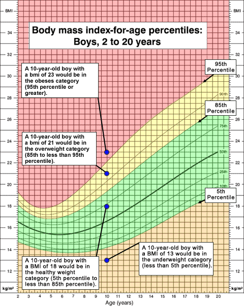
Body Mass Index. Boys 2-20. Body Mass

Body Mass Index. Boys 2-20. Body Mass Index (BMI) is a reliable indicator of body fatness for most people. BMI provides a simple numeric measure of a person’s "fatness" or "thinness". Source: http://www.newcaloriecounter.com/articles/help/help_bmi.html https://ygraph.com/chart/515

Body Mass Index. Boys 2-20. Body Mass

Posted in chart, Health, Sizes

Baby Percentile Chart. Age vs Height: Bo

Baby Percentile Chart. Age vs Height: Boys and Girls. Source: http://www.pampers.co.uk/en_GB/parenting-articles/growing-growing-gone/1416 https://ygraph.com/chart/513

Baby Percentile Chart. Age vs Height: Bo

Posted in chart, Health, Sizes

Post navigation

← Older posts
Newer posts →

Primary Sidebar Widget Area

Top Diagrams

Latest Posts

  • How to Stop Time from Flying
  • Political Party Roles
  • Cell Structure
  • Costa Rica Population
  • Rog
  • Geography Termsgeography Vocabulary
  • Economics Diagrameconomic Flow Diagram 6
  • Map Of Philosophy Of History
  • Macroeconomics Circular Flow Diagram
  • Tajikistan Population
  • Free Body Diagram
  • Fjord Formation
  • Guinea Bissau Births per woman
  • Kazakhstan Population
  • Political Process Definition
  • Horseshoe Political Theory

Top Tags

  • sizes (35)
  • size chart (35)
  • size conversion (35)
  • economy chart (33)
  • economy graph (33)
  • economy diagram (33)
  • cell (29)
  • cell diagram (29)
  • cell illustration (29)
  • window (24)
  • window diagram (24)
  • types of windows (24)
  • origami (16)
  • origami steps (16)
  • how to make origami (16)
  • biology (16)
  • biology diagram (16)
  • yoga (8)
  • yoga routine (8)
  • yoga poses (8)

Categories

  • anatomy
  • Business
  • chart
  • Demographics
  • Eco
  • Ecom
  • Economy
  • Explained
  • GDP
  • Health
  • Maps
  • notice
  • science
  • Signs
  • Sizes
  • Uncategorized

Useful Resources

  • Chart Diagram
  • Meme Gif
  • Logo Sign
  • Human Anatomy
  • Graph Diagram
  • Economy GDP
  • Twitter
Copyright © 2025 Ygraph. All Rights Reserved.
Theme: Catch Box by Catch Themes
Scroll Up
WP Twitter Auto Publish Powered By : XYZScripts.com