Blood Types Chart: The ABO blood group system in human blood transfusion. Blood Type chart shows ABO blood group antigens present on red blood cells and IgM antibodies present in the serum. Source: http://en.wikipedia.org/wiki/ABO_blood_group_system https://ygraph.com/chart/580
Copper Prices Graph 1980 – 2011. Copper
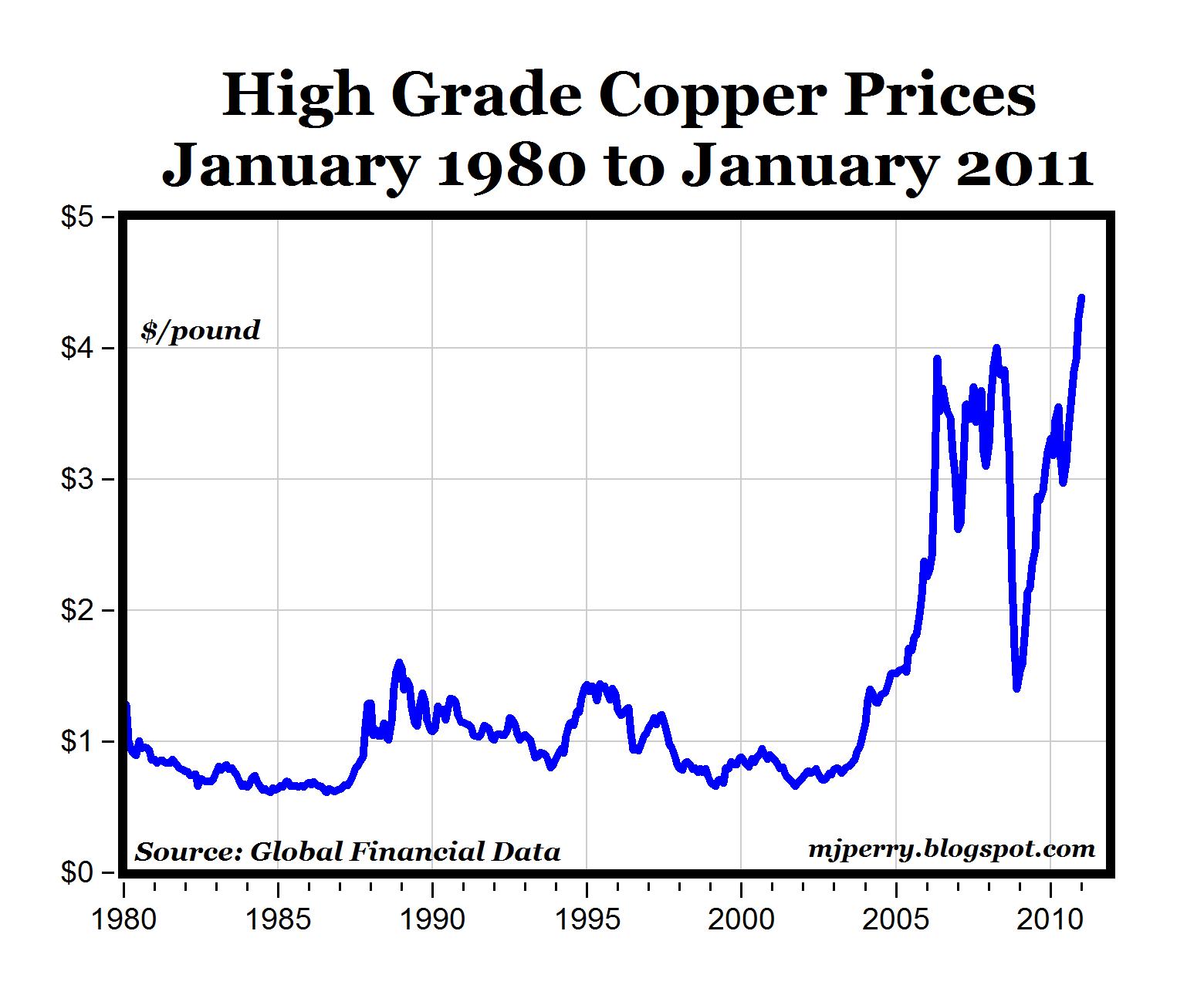
Copper Prices Graph 1980 – 2011. Copper prices in dollars per pound. Rise to Record Highs. Prices have more than tripled since 1980. Source: http://mjperry.blogspot.com/2011/01/copper-prices-rise-to-record-highs.html https://ygraph.com/chart/578
Copper Prices Graph 1980 – 2011. Copper
Copper Prices Chart 2007 – 2010. Source
Copper Prices Chart 2007 – 2010. Source: http://agmetalminer.com/2010/04/09/copper-prices-strong-despite-china-subdued-buying/ https://ygraph.com/chart/576
Copper Prices Chart 2007 – 2010. Source
Copper Prices Chart 2011, Daily. Source
Copper Prices Chart 2011, Daily. Source: http://www.greenenergyinvestors.com/index.php?showtopic=14728 https://ygraph.com/chart/574
Copper Prices Chart 2011, Daily. Source
Kids Weight Chart: Weight in pounds and
Kids Weight Chart: Weight in pounds and Height in inches for both girls and boys, aged Birth – 18 years old. Source: http://www.doh.state.fl.us/family/childhealth/childreport/goals/goal1/weight_chart.jpg https://ygraph.com/chart/572
Kids Weight Chart: Weight in pounds and
Kids Weight Chart – Healthy weights for
Kids Weight Chart – Healthy weights for children, ages 1-18, for boys and girls. Source: http://www.fruitandveggieguru.com/ExtraSections/ProduceandKids/ChildhoodObesity/tabid/77/Default.aspx https://ygraph.com/chart/570
Kids Weight Chart – Healthy weights for
EU GDP Growth Chart 2002 – 2011. Europea
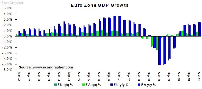
EU GDP Growth Chart 2002 – 2011. European Zone growth in the first half of 2011 was relatively strong in spite of the fiscal challenges within certain Euro states: Greece, Portugal, Ireland and Spain.
Source: http://www.econgrapher.com/top5graphs14may11.html https://ygraph.com/chart/568
EU GDP Growth Chart 2002 – 2011. Europea
Smartphone Growth Chart 2010-2011. An
Smartphone Growth Chart 2010-2011.
Android Growth Stalls. Apple’s iPhone increase as new smartphone buyers prefer Apple’s products.
Source: http://www.businessinsider.com/android-growth-flattens-2011-6 https://ygraph.com/chart/566
Smartphone Growth Chart 2010-2011.
An
Global Car Sales Growth Slows 2010 – 201
Global Car Sales Growth Slows 2010 – 2011. The US and Japan have seen decreasing sales due to the Japanese tsunami, while China and India are shrinking. Source: http://www.thetruthaboutcars.com/2011/06/chart-of-the-day-global-sales-growth-slows-to-a-crawl/ https://ygraph.com/chart/564
Global Car Sales Growth Slows 2010 – 201
Organization Chart Example: President, V
Organization Chart Example: President, Vice-presidents of Marketing, Sales, Production, Finance, Human Resources, Procurement Template for organizing my business. Source:
http://creately.com/examples/org-chart https://ygraph.com/chart/562