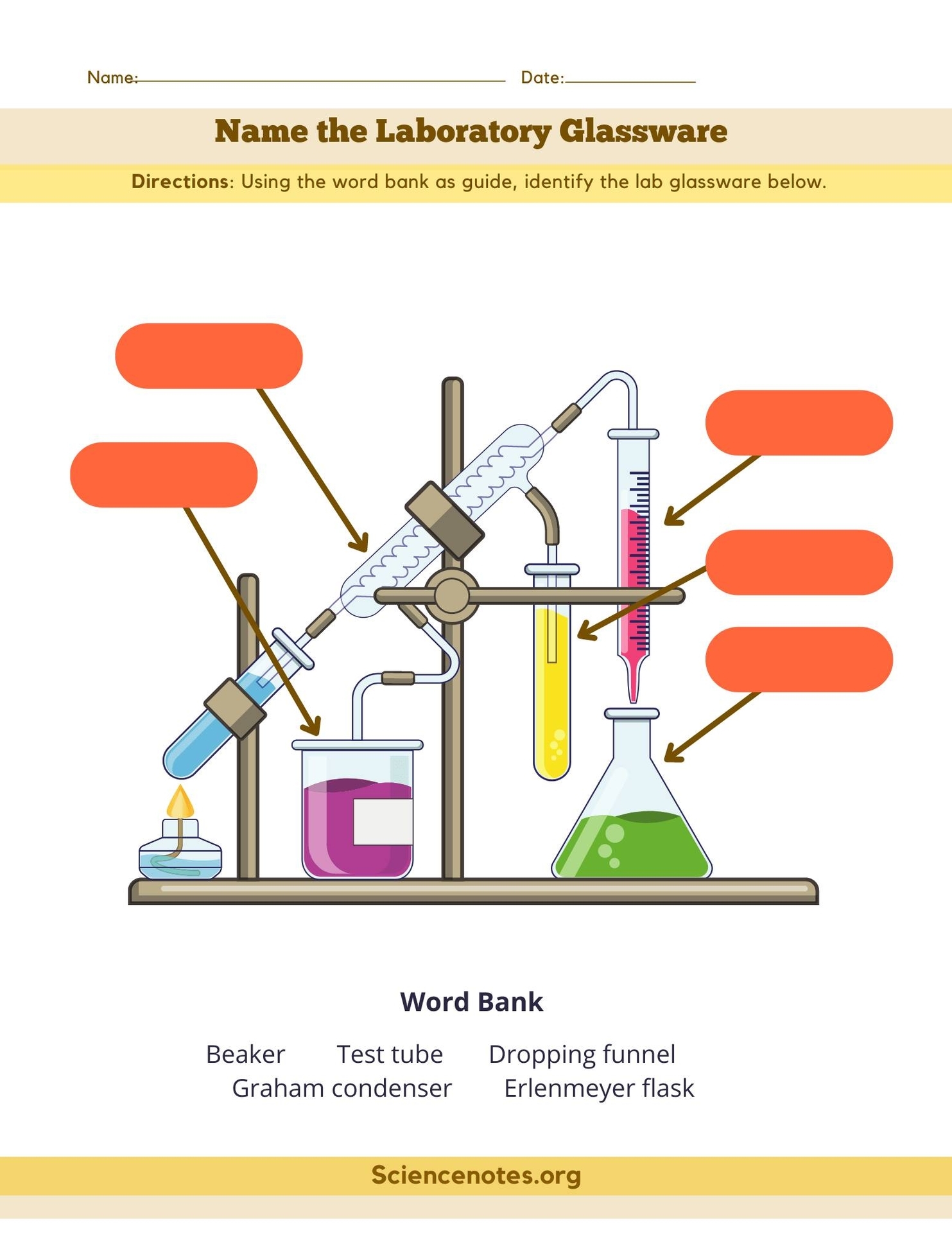
Laboratory Glassware Quiz: A laboratory glassware quiz tests knowledge of different types of glassware used in scientific experiments, such as beakers, flasks, pipettes, and test tubes, and their specific functions.
Charts, Graphs and Diagrams
Laboratory Glassware Quiz: A laboratory glassware quiz tests knowledge of different types of glassware used in scientific experiments, such as beakers, flasks, pipettes, and test tubes, and their specific functions.
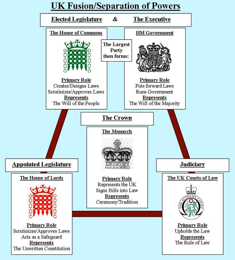
Uk Political System: The United Kingdom operates as a constitutional monarchy and a unitary parliamentary democracy. The monarch serves as the head of state, while the Prime Minister is the head of government. The Parliament consists of two houses
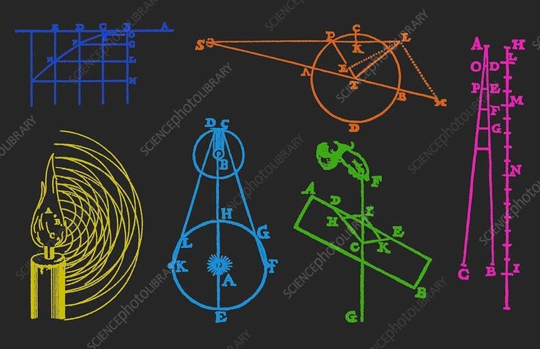
Physics Diagram Explanation: Physics diagrams, such as circuit diagrams, use symbols to represent electrical components and their connections. These diagrams simplify complex circuits, making it easier to understand the flow of electricity and the function of each component.
According to the 2021 Census conducted by Statistics Canada, the Canadian population is made up of various generations of different sizes, and each influences society according to their world view, characteristics, values and stage in their life cycle. The following table shows the percentage of the Canadian population by generation:
| Generation | Age Range | Percentage of Population |
|—————-|————–|——————————|
| Generation Alpha | 8 or younger | 5.8% |
| Generation Z | 9 – 24 | 18.2% |
| Millennials | 25 – 40 | 21.4% |
| Generation X | 41 – 55 | 19.1% |
| Baby Boomers | 56 – 75 | 24.9% |
| Interwar Generation | 76 – 93 | 7.3% |
The baby boomer generation, born between 1946 and 1965, make up less than a quarter of the Canadian population for the first time since the end of the baby boom. They represent 24.9% of the Canadian population, compared with 41.7% in 1966, when they were under the age of 20. Millennials, who are those born between 1981 and 1996, are the fastest-growing generation. Their numbers rose 8.6% between 2016 and 2021. They account for the largest share of the working-age population (33.2%), or those aged 15 to 64.
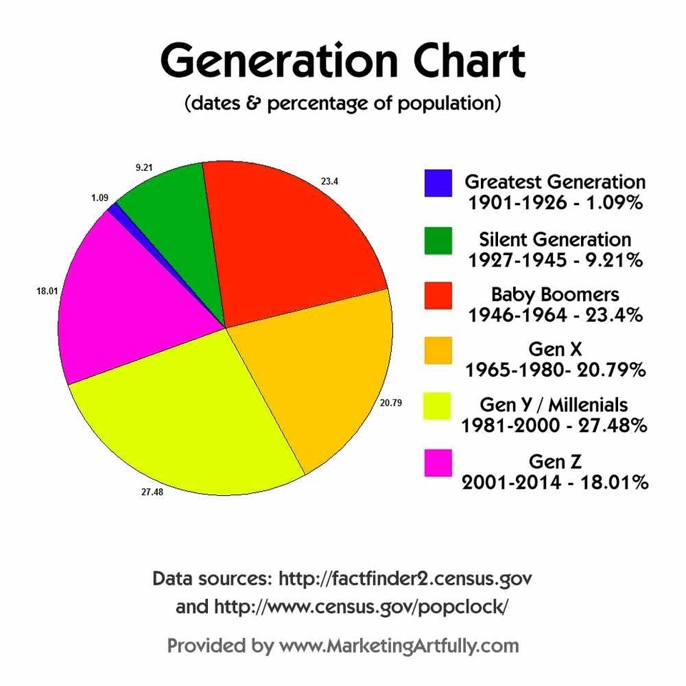
In the United States, the 2021 Census conducted by the US Census Bureau shows that the population is divided into the following generations:
| Generation | Birth Year | Age Range |
|—————-|—————-|—————|
| Generation Alpha | 2013 – present | 0 – 8 |
| Generation Z | 1997 – 2012 | 9 – 24 |
| Millennials | 1981 – 1996 | 25 – 40 |
| Generation X | 1965 – 1980 | 41 – 56 |
| Baby Boomers | 1946 – 1964
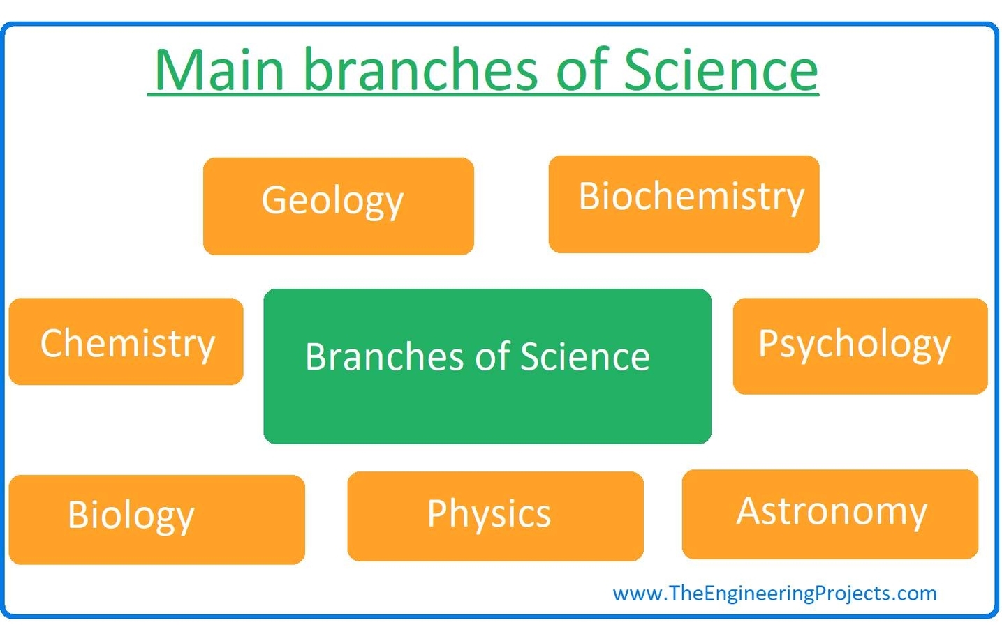
Science and Its Branches: Science is divided into various branches, including physical sciences (physics, chemistry), life sciences (biology, medicine), and social sciences (psychology, sociology). Each branch focuses on specific aspects of the natural world and human behavior, contributing to a comprehensive understanding of the universe.
Science Diagrams That Look Like Memes Example Of: Science diagrams that look like memes often use humor and relatable scenarios to explain scientific concepts. For example, a diagram showing the stages of mitosis might be humorously compared to a dance routine, making the learning process more engaging.

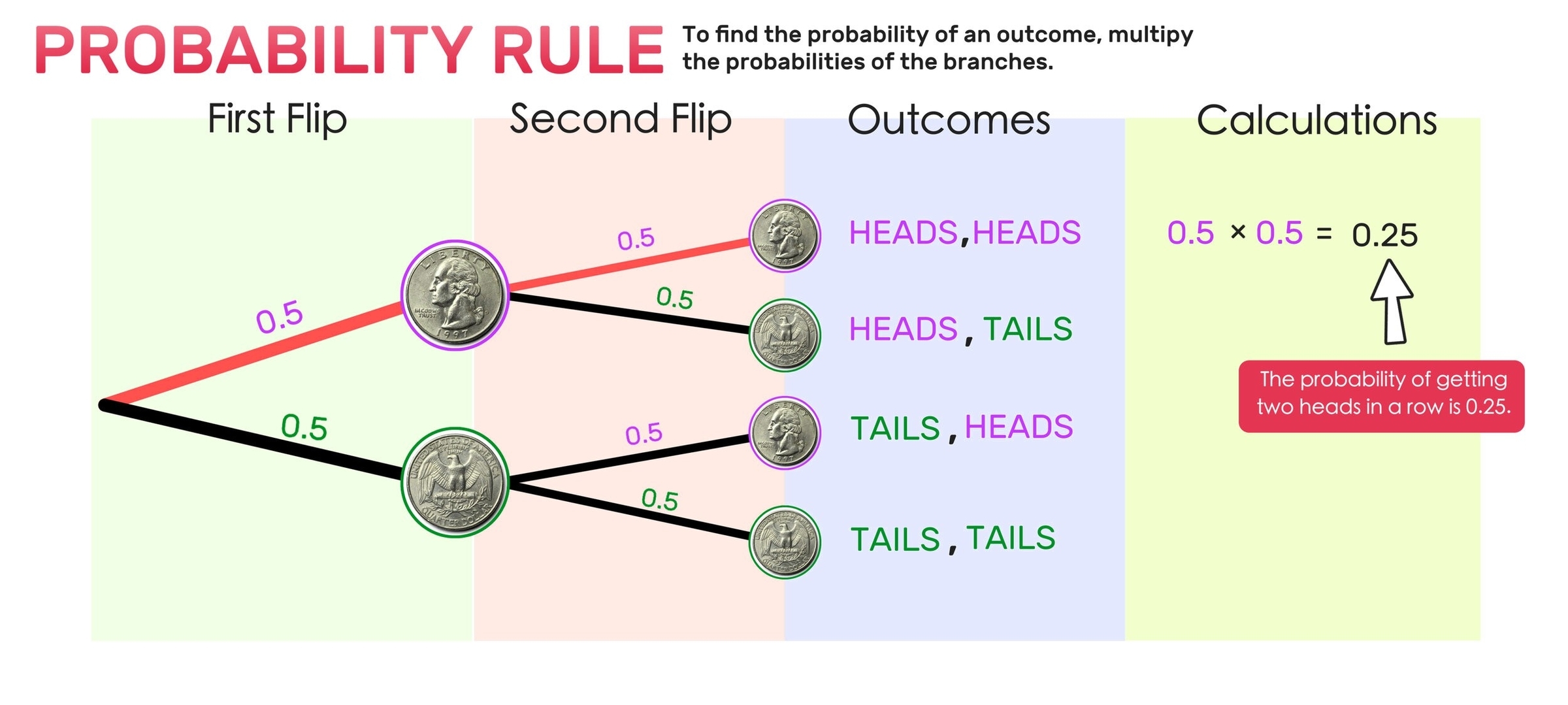
A probability tree is a visual tool used to calculate probabilities of events that are dependent on one another. It is a type of diagram that displays all possible outcomes of an event and the probability of each outcome. Probability trees are useful when you need to calculate the probability of multiple events occurring in sequence.
To create a probability tree, you start by drawing a line that represents the first event. Then, you draw branches that represent the possible outcomes of that event. Each branch is labeled with the probability of that outcome. Next, you draw lines from each branch that represent the second event. Again, each branch is labeled with the probability of that outcome. You continue this process until you have included all the events you want to consider.
Once you have created a probability tree, you can use it to calculate the probability of any combination of events. To do this, you multiply the probabilities along the branches of the tree that correspond to the events you are interested in. For example, if you want to calculate the probability of event A and event B occurring, you would multiply the probability of event A by the probability of event B given that event A has occurred.
Probability trees are commonly used in fields such as finance, insurance, and engineering to model complex systems and calculate the probability of different outcomes. They are also used in probability theory to teach students about probability and to help them visualize complex problems.
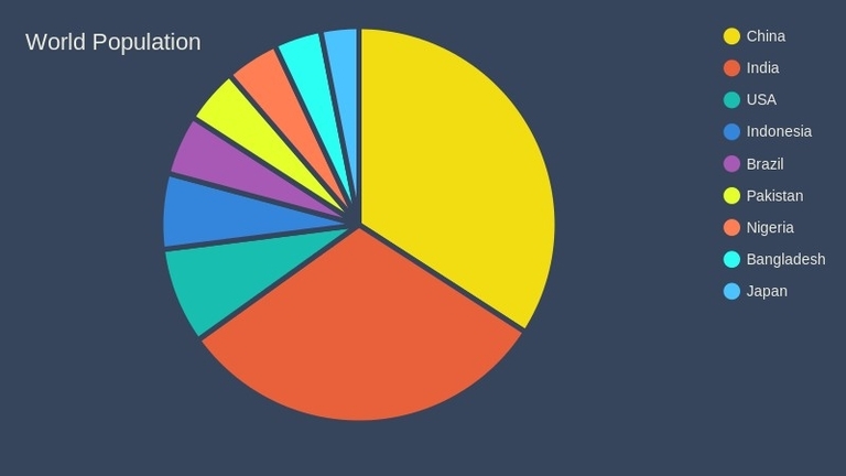
The world population is a diverse mix of ethnicities and cultures. According to the CIA World Factbook, there are over 7000 ethnic groups in the world. However, the distribution of these ethnic groups is not uniform across the world.
The Kaiser Family Foundation provides a comprehensive report on the population distribution by race/ethnicity in the United States. According to their report, the largest ethnic group in the United States is White, comprising 60% of the population, followed by Hispanic/Latino (18%), Black (12%), Asian (6%), and other races (4%).
On a global scale, the Infogram website provides an interactive pie chart that shows the racial composition of the world population. According to the chart, the largest ethnic group in the world is Han Chinese, comprising 18.1% of the world population, followed by South Asians (16.3%), Europeans (9.6%), Sub-Saharan Africans (9.4%), Arabs (5.2%), and other ethnic groups (41.4%).
It is important to note that the racial composition of the world population is constantly changing due to various factors such as migration, birth rates, and mortality rates. Therefore, the data presented here may not be up-to-date.
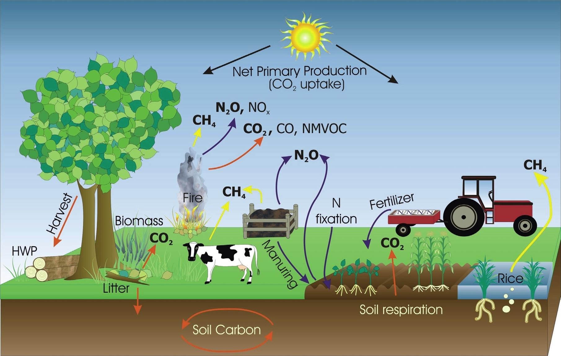
Greenhouse gas emissions from farming are the result of various agricultural activities that release carbon dioxide (CO2), methane (CH4), and nitrous oxide (N2O) into the atmosphere. These gases contribute to global warming and climate change by trapping heat and altering the Earth’s energy balance. Farming is both a source and a sink of greenhouse gases, meaning that it can either emit or absorb them depending on the practices and management of the land.
According to the Intergovernmental Panel on Climate Change (IPCC), agriculture accounted for about 10.6% of global anthropogenic greenhouse gas emissions in 2010. However, this estimate does not include emissions from land use change and forestry, which are often associated with agricultural expansion and intensification. If these emissions are included, the share of agriculture in global greenhouse gas emissions could be as high as 24%^2^.
The main sources of greenhouse gas emissions from farming are:
– Enteric fermentation: This is the process by which ruminant animals, such as cattle, sheep, and goats, digest plant material in their stomachs and produce methane as a by-product. Methane is a potent greenhouse gas, with a global warming potential (GWP) of 28 times that of CO2 over a 100-year period. Enteric fermentation is the largest source of methane emissions from agriculture, accounting for about 40% of total agricultural emissions in 2010.
– Manure management: This is the handling and storage of animal waste, which can also produce methane and nitrous oxide emissions. Methane is generated when manure decomposes anaerobically (without oxygen), such as in liquid or slurry systems. Nitrous oxide is emitted when manure is applied to soils or stored in aerobic (with oxygen) conditions, such as in solid or dry systems. Manure management contributed about 16% of total agricultural emissions in 2010.
– Synthetic fertilizers: These are chemical substances that provide nutrients, such as nitrogen and phosphorus, to crops and enhance their growth and yield. However, when applied in excess or under inappropriate conditions, synthetic fertilizers can also cause nitrous oxide emissions from soils. Nitrous oxide is a powerful greenhouse gas, with a GWP of 265 times that of CO2 over a 100-year period. Synthetic fertilizers were responsible for about 13% of total agricultural emissions in 2010.
– Rice cultivation: This is the production of rice, which is a staple food for more than half of the world’s population. Rice cultivation involves flooding the fields with water, creating anaerobic conditions that favor methane production
Basic Body Diagram: A basic body diagram outlines the major parts of the human body, including the head, torso, arms, and legs. It serves as a foundational reference for studying human anatomy and physiology.