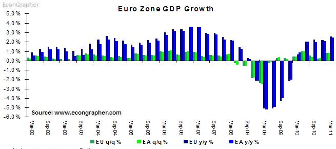
EU GDP Growth Chart 2002 – 2011. European Zone growth in the first half of 2011 was relatively strong in spite of the fiscal challenges within certain Euro states: Greece, Portugal, Ireland and Spain.
Source: http://www.econgrapher.com/top5graphs14may11.html https://ygraph.com/chart/568
Category Archives: Economy
Copper Prices Chart 2011, Daily. Source
Copper Prices Chart 2011, Daily. Source: http://www.greenenergyinvestors.com/index.php?showtopic=14728 https://ygraph.com/chart/574
Copper Prices Chart 2011, Daily. Source
Copper Prices Chart 2007 – 2010. Source
Copper Prices Chart 2007 – 2010. Source: http://agmetalminer.com/2010/04/09/copper-prices-strong-despite-china-subdued-buying/ https://ygraph.com/chart/576
Copper Prices Chart 2007 – 2010. Source
Copper Prices Graph 1980 – 2011. Copper
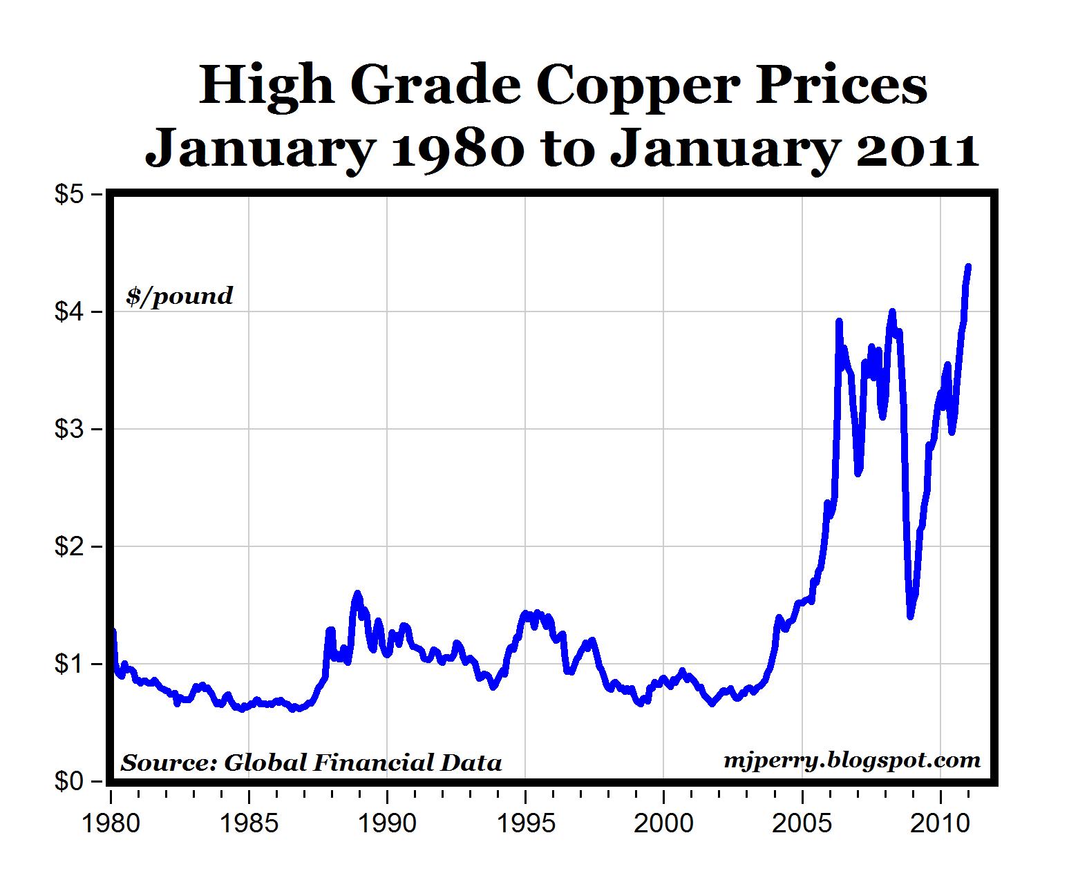
Copper Prices Graph 1980 – 2011. Copper prices in dollars per pound. Rise to Record Highs. Prices have more than tripled since 1980. Source: http://mjperry.blogspot.com/2011/01/copper-prices-rise-to-record-highs.html https://ygraph.com/chart/578
Copper Prices Graph 1980 – 2011. Copper
Gold Prices Graph. Gold Prices Chart.
Gold Prices Graph. Gold Prices Chart. Gold price adjusted to inflation 1880-2010. Historical long-term trend shows that gold is below its historical heights as seen from the graph. Source: http://thedraconian.com/2011/01/06/predictions-for-2011-part-one/ https://ygraph.com/chart/685
Gold Prices Graph. Gold Prices Chart.
Gold Prices Chart. 10 years, 2001 – 2011
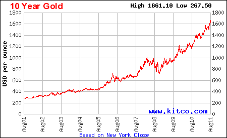
Gold Prices Chart. 10 years, 2001 – 2011. Kitco Gold Chart. Gold prices increased from the lows of $267 per ounce to highs of $1661 as of August 2011. Gold bullion price movements. Source: http://www.kitco.com/charts/livegold.html https://ygraph.com/chart/688
Gold Prices Chart. 10 years, 2001 – 2011
Gold Prices Graph 2011. 1 Year gold pri
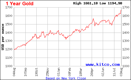
Gold Prices Graph 2011. 1 Year gold prices chart showing prices movement in the past year 2010-2011. Gold have increased in price dramatically from $1200 to over $1600 dollars per ounce. Source: http://www.kitco.com/charts/livegold.html https://ygraph.com/chart/686
Gold Prices Graph 2011. 1 Year gold pri
USA Housing Market. Case-Shiller Home Pr
USA Housing Market. Case-Shiller Home Price Index Report. Double Dip Accelerates. 1988 – 2011. Source: http://www.businessinsider.com/chart-of-the-day-april-case-shiller-2011-6 https://ygraph.com/chart/530
USA Housing Market. Case-Shiller Home Pr
The S&P 500 is nearing its 200-day m
The S&P 500 is nearing its 200-day moving average June 2011, (an average of the last 200 days), which to many people is a crucial point of support for the market. Source
: http://www.businessinsider.com/chart-of-the-day-sp-vs-200-day-moving-average-2011-6 https://ygraph.com/chart/540
The S&P 500 is nearing its 200-day m
Existing Home Inventory 2002-2011. Th
Existing Home Inventory 2002-2011.
The housing market’s negative effect on the economy. Housing inventory continues to grow, economy cannot recover. Source: http://www.businessinsider.com/chart-of-the-day-months-of-existing-housing-inventory-2011-6 https://ygraph.com/chart/541