7 Practical Ways to Slow Down Your Days
Do you ever feel like weeks slip by in a blur? You blink, and it’s already the weekend—or even the end of the year. That fast-forward feeling is surprisingly common, but the good news is there are simple strategies to slow it down. If you’re wondering how to stop time from flying, you’re in the right place. Here are 7 proven tips to help make your days feel longer, more meaningful, and fully lived.
1. Add Novelty to Your Routine
Our brains encode new experiences more vividly than repetitive ones. If every day feels the same, time compresses in memory. Try something new—a hobby, a new recipe, or even a different walking route. Variety stretches your perception of time and creates a richer mental timeline.
2. Practice Mindfulness and Presence
Being fully present in the moment slows time down. Whether you’re drinking coffee or folding laundry, focus completely on the experience. Mindfulness meditation and breathing techniques can also anchor you in the now and help prevent time from slipping away unnoticed.
3. Keep a Daily Journal
Writing down what you did each day helps solidify the memory of it. Even a short journal entry acts as a time marker, giving your brain more to recall later. It’s a powerful way to make time feel fuller and less like it’s vanishing.
4. Break Up Your Week with Micro-Adventures
Don’t wait for vacations to shake things up. Plan small adventures throughout your week. Go to a new café, try a local museum, or explore a new neighborhood. The more novel experiences you insert into your regular schedule, the less your life blurs together.
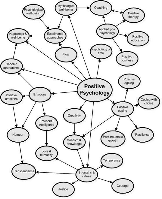
5. Engage in Deep Work or Flow Activities
Time flies in the moment when you’re focused—but paradoxically, those same moments feel long and rewarding in memory. Get lost in activities you love or find meaningful: writing, painting, coding, gardening. That deep focus stretches time in the long run.
6. Take Photos and Reflect
Take intentional photos of people, places, and things—not everything, just the highlights. Reviewing your photos at the end of the week or month helps reinforce those moments, building a sense of time well spent and remembered.
7. Spend Time Offline with People
Conversations, shared meals, and real-life experiences stick with us more than scrolling social media. Being present with others doesn’t just build stronger relationships—it also helps you mark time in more meaningful ways. Trust me on this 🙂
Make Time Count
If you’re constantly wondering how to stop time from flying, remember it’s not about slowing the clock—it’s about filling your life with presence, meaning, and memorable moments. By making small, intentional changes to how you live each day, you can create a sense of time that feels expansive instead of elusive.
Try just one of these tips this week and notice how your days begin to feel different.