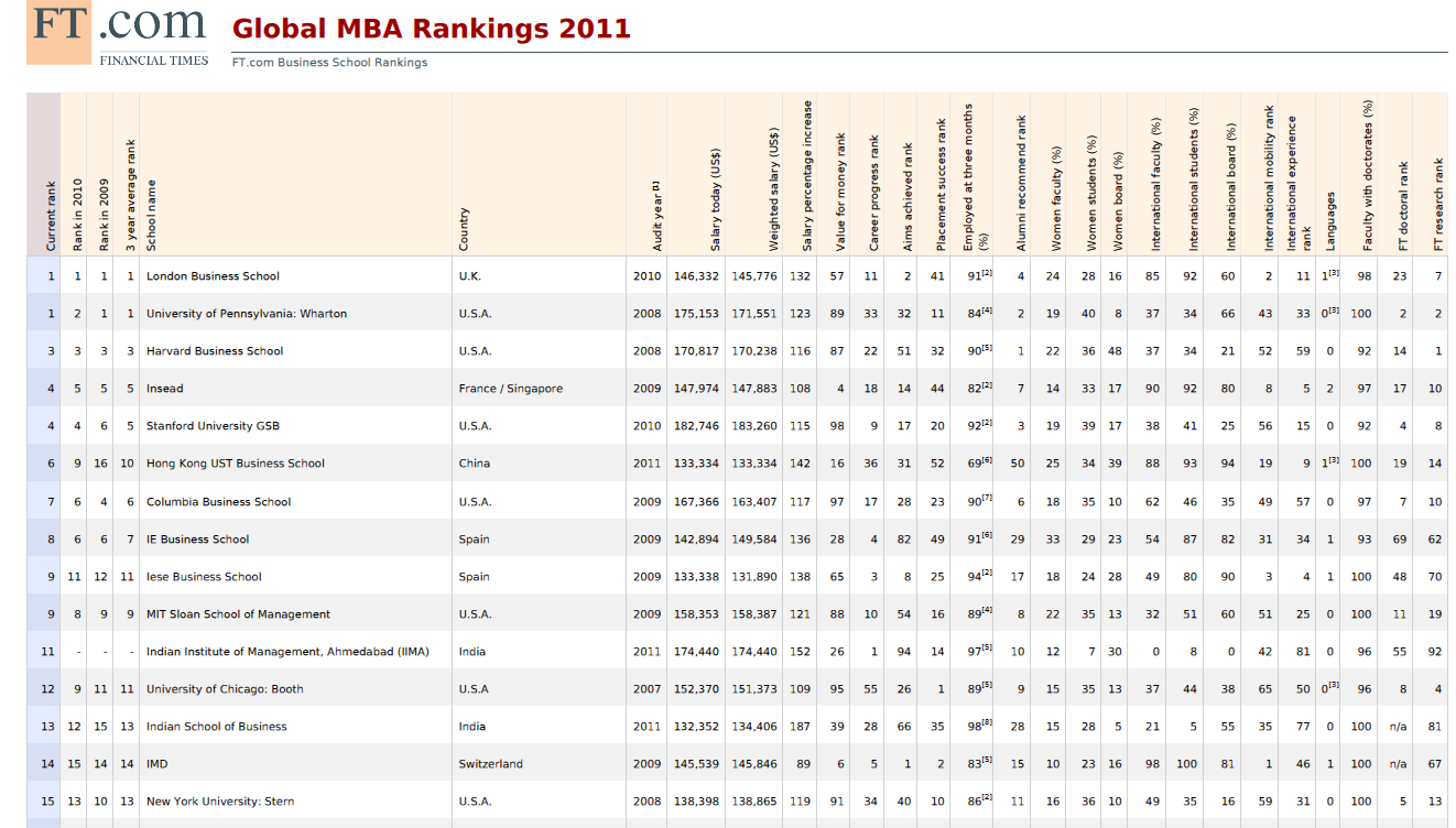
MBA Rankings Chart. Global MBA Ranking 2011 by Financial Times. Top MBA schools internationally. Best MBA Universities according to Financial Times. Top MBA programs including London Business School, Wharton MBA, Harvard MBA, Stanford. Source: Financial Times https://ygraph.com/chart/1326
Category Archives: Explained
MBA 2011. MBA 2010. MBA Chart of the
MBA 2011. MBA 2010. MBA Chart of the best business schools in USA, Canada and globally, according to Business Week. What is an MBA and what is the best MBA school in 2011 and 2011. Top MBA education and rankings chart. Source: BusinessWeek https://ygraph.com/chart/1327
MBA 2011. MBA 2010. MBA Chart of the
MBA Salary Chart International by functi
MBA Salary Chart International by function in 2011. Consulting, energy and banking are highest in terms of MBA salary post graduation. MBA pay chart. Source: Tranquilstorm https://ygraph.com/chart/1328
MBA Salary Chart International by functi
MBA Salary Chart by Country. Highest pa
MBA Salary Chart by Country. Highest paid MBA graduates are in USA, UK, Japan and Canada. MBA salaries vary. Source Tranquilstorm https://ygraph.com/chart/1329
MBA Salary Chart by Country. Highest pa
Education Chart. University Education G
Education Chart. University Education Graph 1992-2010. The employment gap between the educated and the uneducated is incredible, demonstrating that education is important. Unemployment rate. University education is the best. Source: Business Insider https://ygraph.com/chart/1330
Education Chart. University Education G
University Education Comparison to High
University Education Comparison to High School Salary and Unemployment Rate Chart. Earnings, unemployment and level of education. Doctoral degrees, professional degrees, master degrees, bachelor’s, college and high school. Education pays. Source: Bureau of Labor https://ygraph.com/chart/1331
University Education Comparison to High
Best Cell Phone Providers 2011 Chart in
Best Cell Phone Providers 2011 Chart in USA – Best mobile providers, top wireless carriers chart in 2011. Comparisson between Verizon, AT&T, Sprint, T-mobile. Review of cellphone providers plans, cell phone offering, fees and plans. Source: Top Ten Reviews https://ygraph.com/chart/1332
Best Cell Phone Providers 2011 Chart in
Cell phone plans comparison Canada Chart
Cell phone plans comparison Canada Chart. Mobile plans compared. The best wireless providers chart. Comparison of different plans, services in the mobile industry. Rogers, Bell, TELUS, Mobilicity, Wind, Fido and other mobile providers. Source: Prepaid Wireless Guide https://ygraph.com/chart/1333
Cell phone plans comparison Canada Chart
Top Smartphones – Top Android phones. C
Top Smartphones – Top Android phones. Chart 2011. Best Smartphone and top cell phones from HTC, Motorola, Apple, Samsung. Top 10 Cellphones. Top 10 Smartphones. Source: PCWorld https://ygraph.com/chart/1334
Top Smartphones – Top Android phones. C
Smartphone Chart. Smartphone Market Shar
Smartphone Chart. Smartphone Market Share Chart 2011, 2012, 2013, 2014, 2015. These numbers are best-estimates. Smartphone trends are clear, with Android dominating the market (+40%) and iPhone enjoying a sizable chunk (~16%). Doubts about Windows, RIM and Symbian’s. Best Mobile phones. Source: ShoutEx smartphones chart